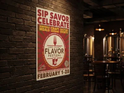
Lake County Flavor Festival
Restaurant weeks look like restaurant weeks. Slick food photography, clean sans-serifs, the same visual language that says “curated dining experience” in every market. Lake County had been doing it that way for years.
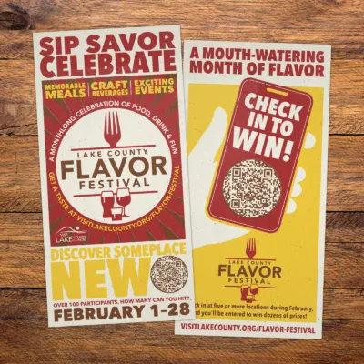
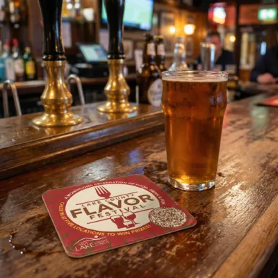
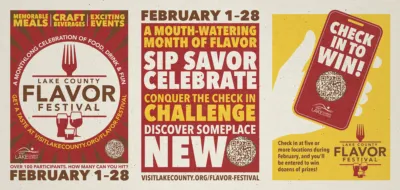
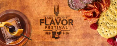
When the county consolidated its winter dining and craft beverage programs into a single monthlong event, it was a chance to do something different. Rather than polish it up, we roughed it down — looking to Hatch Show Print and the tradition of American letterpress for a visual language that felt handmade, local, and earned. Something that didn’t look like it came from a tourism office.
The name came first. Flavor Festival over Restaurant Week — broader, more celebratory, harder to ignore.
The identity followed: a mark built around the fork and glass, type that carried weight and texture, a palette of red and gold on cream that felt more like a broadside than a brochure.
The work launched in 2025. The client brought it back for 2026 with the same identity at its core — which is, in the end, the best thing a brand can do.